Nippon Professional Baseball Logos
Here's a quick post on the style and evolution of Japanese league team logos. Compared to classic American and National League teams' logos in the Majors, some Nippon Professional Baseball (NPB) logos appear to be cartoonish, adorable insignias that are uniquely Japanese in nature. Take the newer Chiba Lotte Marines logo (adopted in 2001) for example. It is a white bird (possibly a seagull) that has cute and amiable facial features such as adorable big eyes and a slight smile (up to interpretation). The hawk used in the Fukuoka SoftBank Hawks logo is quite similar in that the bird appears to be smiling and has goofy, friendly looking eyes. You would be hard pressed to find a logo of this sort in any American professional sport today. There were logos of a similar style back in the 1970s and 80s, but they have mostly been updated over time. For example, the San Diego Gulls, formerly of the West Coast Hockey League, changed their team logo from a drawing of a happy ice skating big bird to a streamlined serious looking gulls logo that a had an angry style eye in the early 1990s. The logo evolved even more five years later, when this intimidating Gulls logo appeared. Similarly, the Arizona Cardinals changed their helmet insignia to make the red bird look more fierce sometime last decade. One can predict that the NPB logos will change in a similar fashion over the next decades, but you never know. One thing is for certain: a lot of the NPB logos are, like the style of play across the Pacific, uniquely Japanese, and for that you've gotta love 'em. I much prefer the incredible 1990s Marines' logo, which has a Hartford Whalers kind of feel about it, and is much more old school looking:

Other examples of cutesy looking Japanese league logos are the Chunichi Dragons logo (which appeared in 2000) and the Yokohama BayStars logo that has been used since 1993. The Dragons logo might appear downright ridiculous to an American sports fan's eye because it is practically just a cartoon rendition of a dragon, and a very benign one at that. Like the Marines white bird, the Chunichi Dragons logo features large, cute looking eyes. One would think that designers would create an aggressive looking, fire breathing dragon instead of a smiling, youthful looking "beast," but that's just how it is in Japan. Logos that may look amateur and out of place to American baseball lovers are simply accepted and ingrained across the Pacific. I included the BayStars logo because it is extremely cartoonish in nature. That logo, like the ones mentioned above, is absolutely one of a kind.
Here are some classic Japanese baseball logos: This one has been used since by the Tokyo based Giants since 1947 and has characteristics similar to the old New York Giants patches:
 Another NPB classic that is still in use today is the Hanshin Tigers logo that seems to be modeled off one of the original Detroit Tigers logos:
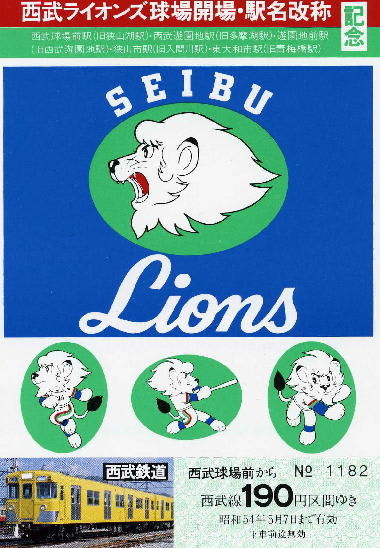
Other Japanese baseball logo standouts include:


And last but not least, the Central League logo which was designed in 1949 and is still in use today:

 This one has been used since by the Tokyo based Giants since 1947 and has characteristics similar to the old New York Giants patches:
No comments:
Post a Comment